Client |

Micronet

Year

2016

King of the road

For the past several decades, Micronet a NASDAQ traded public company has been developing mobile computing systems for fleet and workforce management. Following strong industry trends and regulatory requirements the company entered considerable expansion without full specification and differentiation of its products in the market. The challenges faced in this project were to define a clear brand identify for Micronet’s business ecosystem of devices, software and services.

Services Provided

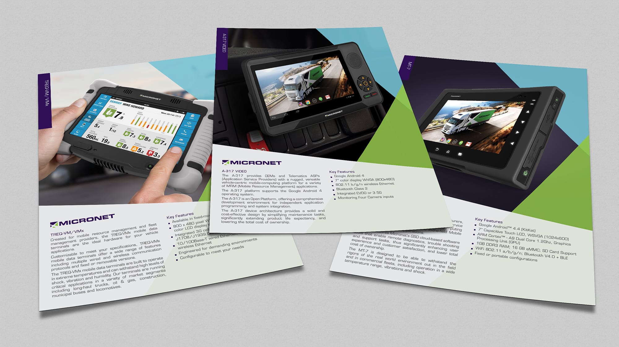
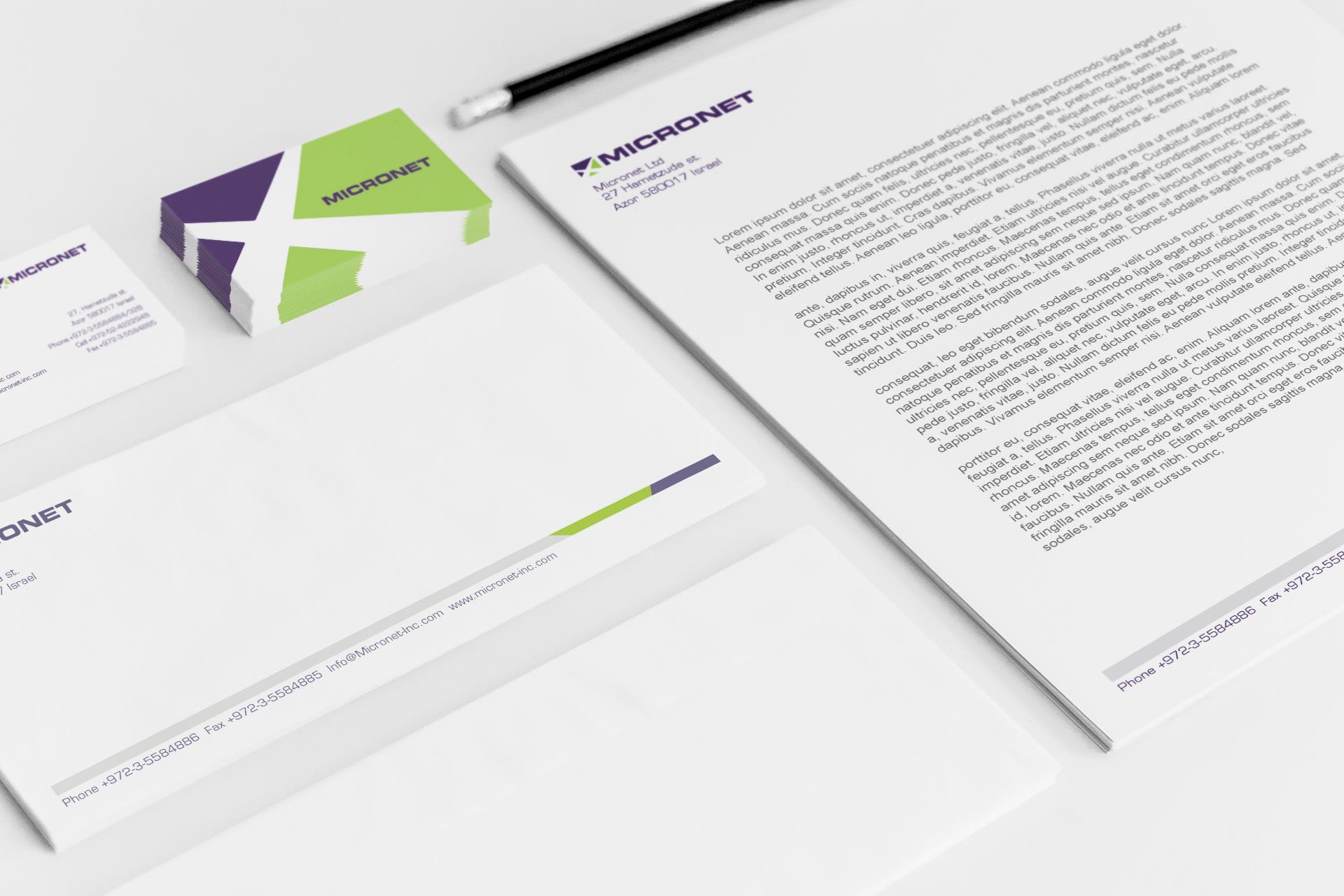
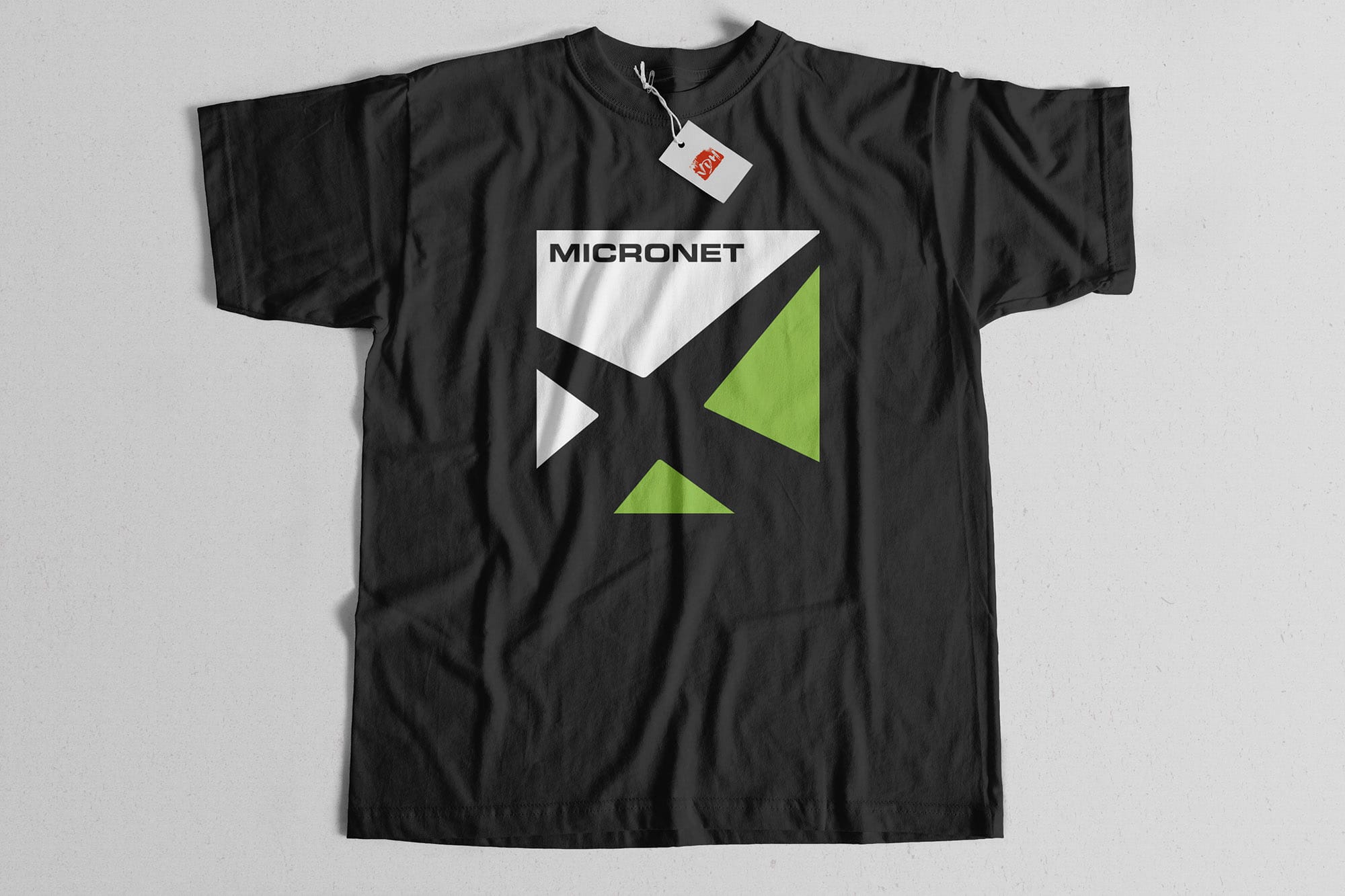
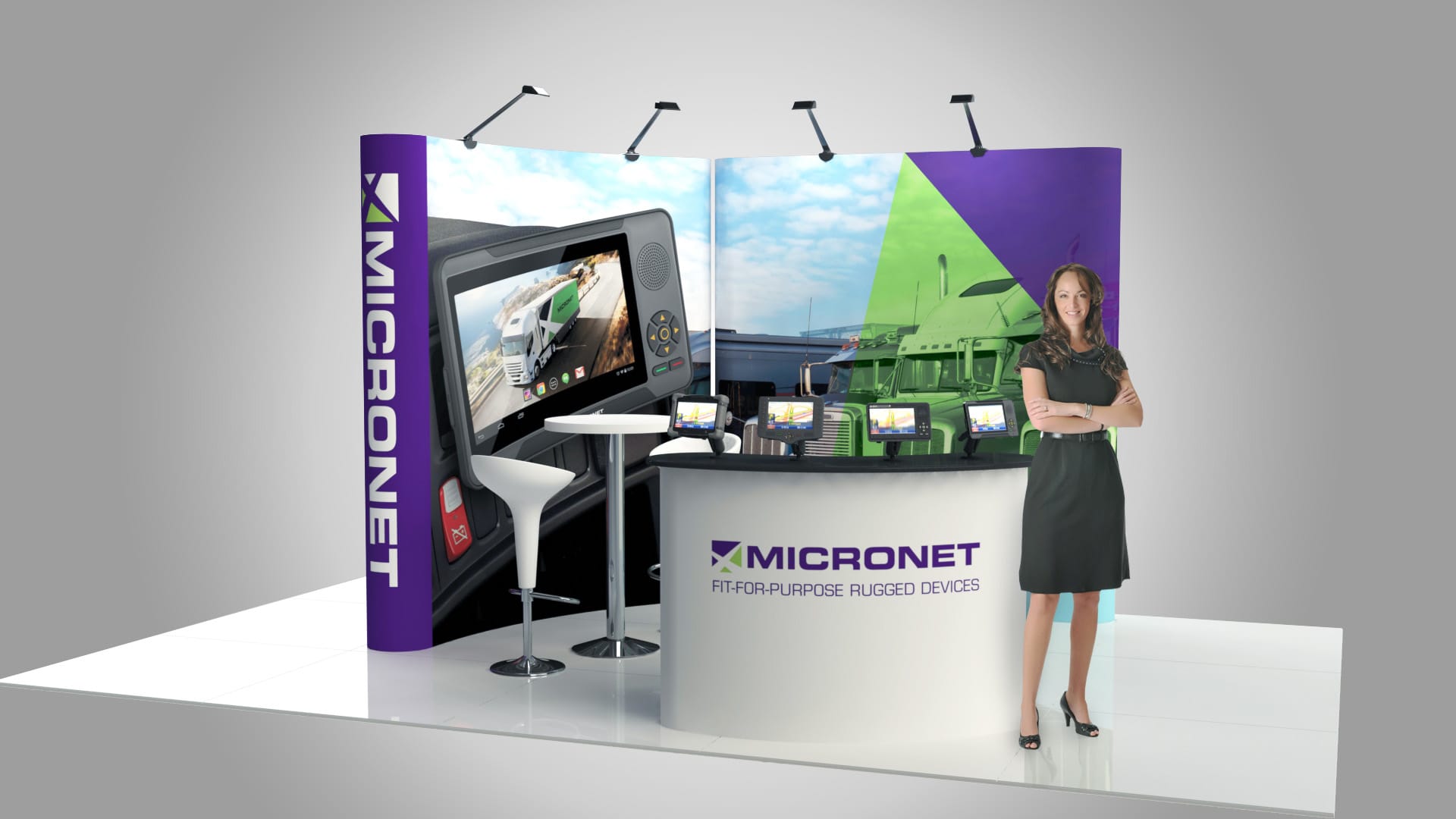
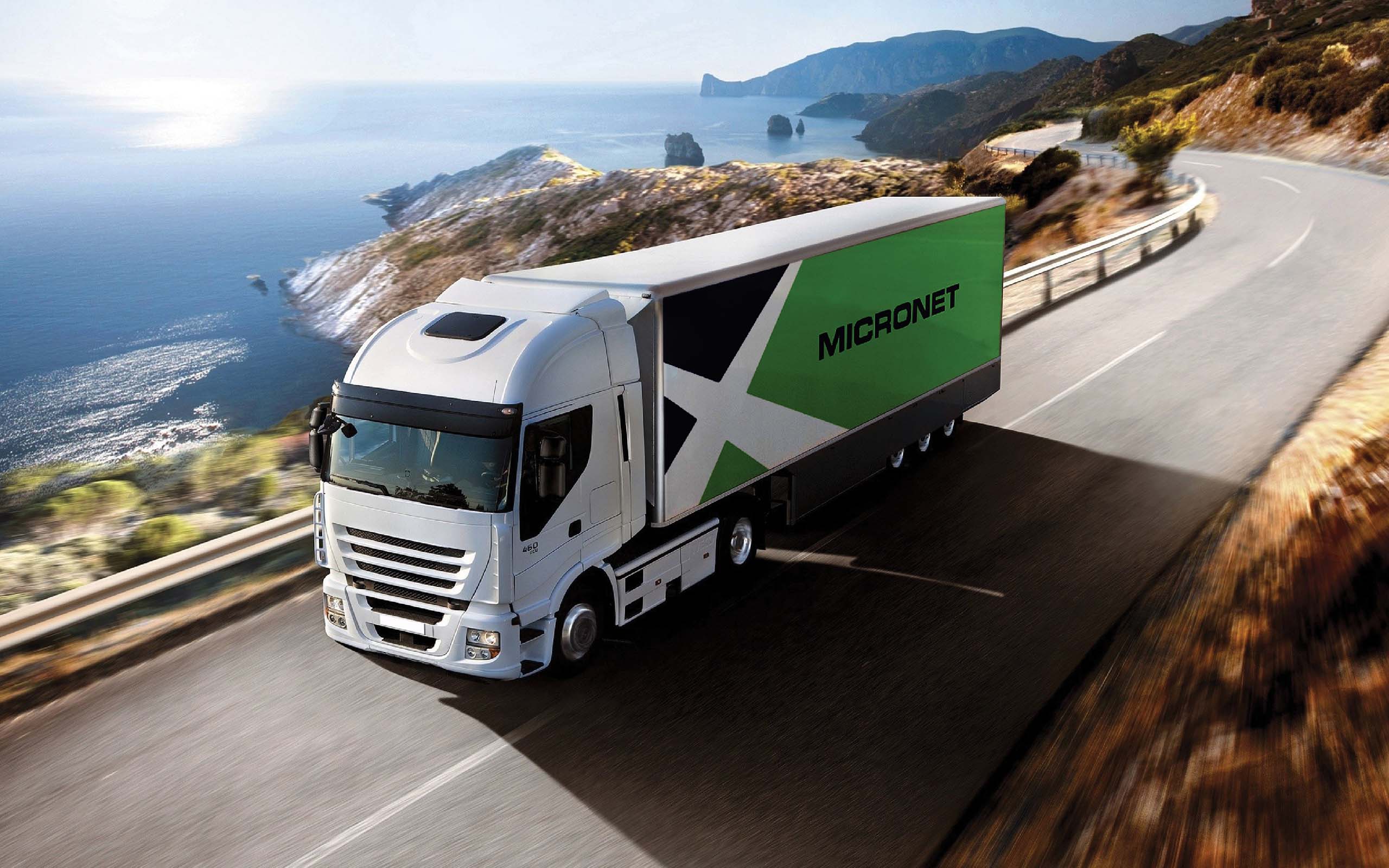
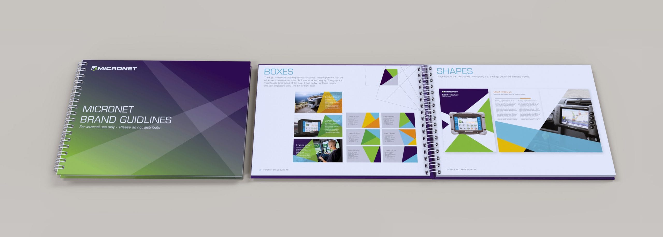
Micronet existing and new products were repositioned as durable highly dependable work companions while on the road. The new graphic design, logos, imagery and patterns refresh the Micronet brand values as a leading, innovative and global provider in the mobile devices space.
Flyer Mockup

Explore More

Client |

Junny

Get excited!

Junny is a young and vibrant traveling company that markets vacation and resort deals for close to Israel destinations, up to a two-hour flight. Its sales representatives and local hosts are Hebrew speakers and will assist in creating the ultimate getaway vacation.

Client |

Vaica Medical

Don't forget your meds

Taking daily medication no matter how important, can easily be forgotten when everyday life gets in the way. A medical device company approached the studio with a project that combines product and user interface design with an emphasis on the users’ experience. The challenge in this project was to design and develop a smart medication dispenser that is portable, discreet and fits various medication modalities.

Client |

TAT Technologies

Cools you wherever you are

A global aerospace solutions group with multiple subsidiaries and brand was in need of consolidating and refreshing its image. The studio was responsible for a complete overhaul of the group’s logos and visual art language to fit the company values and its target industries.
Studio
Typically replies in minutes

Hi there!
Please feel free to tell us about your project